Brand idea
Simple skincare that feels familiar.
NINA makes everyday skincare feel easy, gentle, and personal — without making skincare feel complicated.
Name — NINA
The name NINA was chosen to feel like a person rather than a traditional beauty brand. Its familiar and approachable character reflects the brand’s belief that skincare should feel personal, simple, and easy to incorporate into everyday life. NINA feels warm and friendly — like a name you already know.
Logo & Illustration
The handwritten logo adds a human and personal touch to the identity, keeping the brand soft and approachable rather than overly polished or clinical. A small hand-drawn plant illustration works as a supporting brand asset, subtly reflecting NINA’s gentle and natural character while adding a sense of imperfection and individuality. Together, these elements create a visual identity that feels human, calm, and effortlessly familiar.


Vision
To make everyday skincare feel like a simple moment of self-care.
Mission
To create simple, gentle skincare products that fit naturally into everyday life.
Effortless
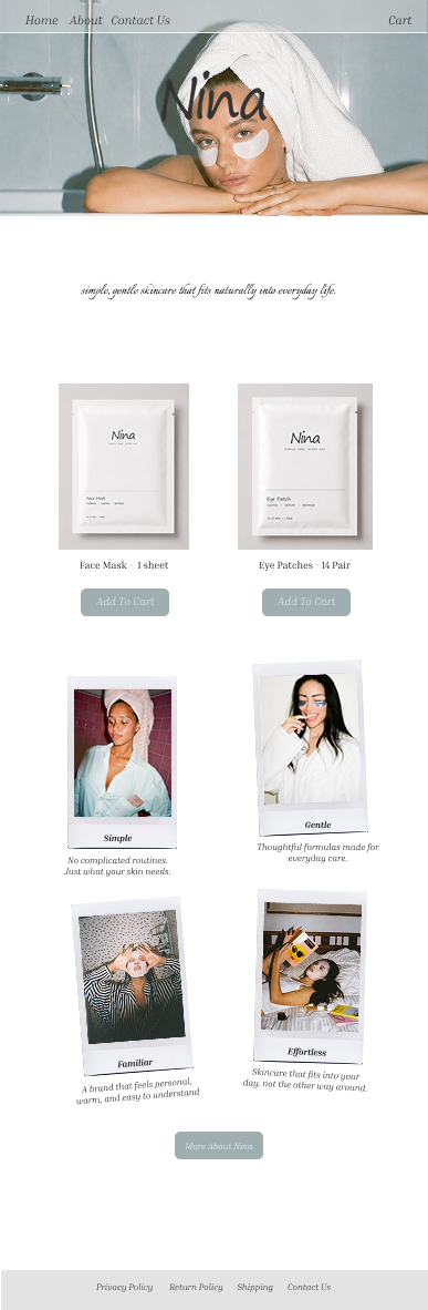
Skincare that fits into your day, not the other way around.
Simple
No complicated routines. Just what your skin needs
Gentle
Thoughtful formulas made for everyday care.
Familiar
A brand that feels personal, warm, and easy to understand.
Target Audience
Women aged 20–35
Women who care about their skin but prefer simple, gentle, and easy-to-use products over complicated skincare routines.
They value:
simplicity
natural-looking beauty
wellness
comfort
products that fit their lifestyle
Strategy
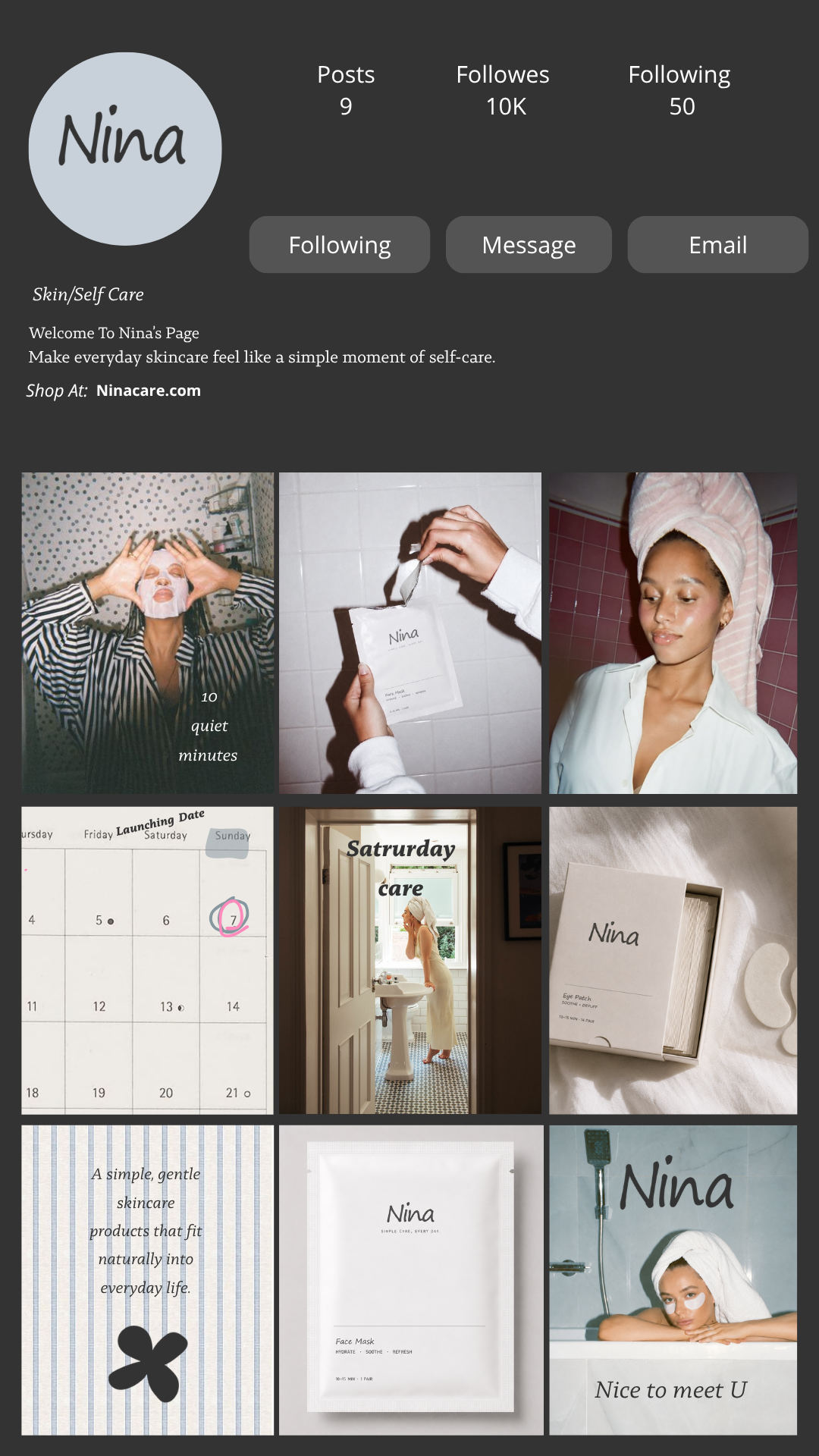
Build familiarity through relatable content, a calm visual identity, and a small circle of lifestyle influencers who naturally embody the NINA girl.

Packaging Direction
The packaging follows NINA’s simple, warm, and approachable personality. A clean neutral palette, generous whitespace, and minimal typography create a calm and effortless feel, while handwritten details and subtle textures add a personal, human touch. The design keeps the product clear and functional without losing the softness of the brand.


Content pillars:
01 — Everyday Rituals
Morning routines, after-shower moments, getting ready.
02 — Product
Simple education around ingredients + benefits.
03 — Lifestyle
Home, coffee, self-care, quiet moments.
04 — People
Influencers and real women naturally incorporating NINA into their routines.
UX / UI Design
The digital experience follows NINA’s simple and approachable identity, with a clean interface that makes information easy to find and products easy to explore. The design focuses on clear navigation, effortless browsing, and communicating what NINA stands for—simple, gentle, and everyday skincare—through both the content and visual language.