Meet Nerina
A soft summer beauty concept built around light, effortless glam.
Nerina explores a fresh, playful approach to beauty through a soft and refined visual identity.
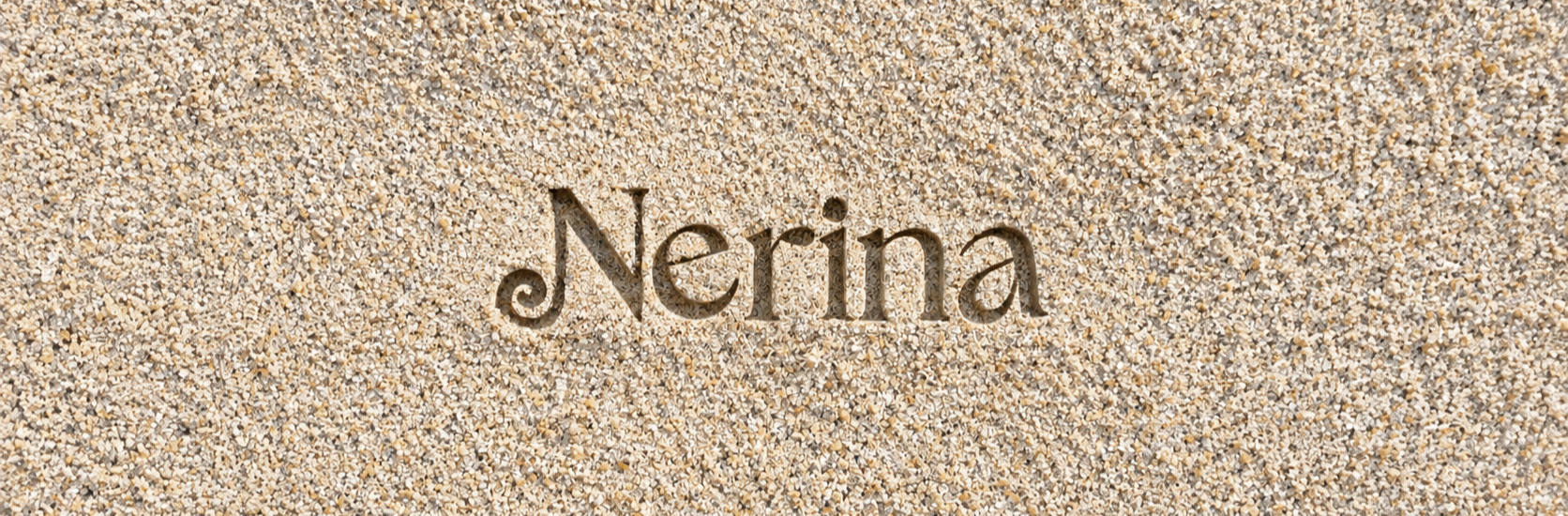
The Name — Nerina
The name Nerina was chosen for its feminine, delicate sound and its connection to the sea through the Nereids — sea nymphs in Greek mythology.
This made it a natural fit for the concept: soft, feminine, playful, and inspired by the sea.
The Logo
The logo was kept simple and soft to reflect Nerina’s approachable and effortless character, while leaving room for the seashell and summer-inspired elements to become part of the wider identity.
The Idea Behind the Design
Making the concept part of the design.
For Nerina, I focused primarily on the visual identity and how the concept could live across every design element.
Rather than simply using summer-inspired colors, I translated the feeling of light summer into the products themselves — from sandy textures and soft, wave-like curves on the glosses to subtle seashell-inspired details.
02 VISUAL DIRECTION
Making summer part of the design.
Sandy textures, wave-like curves, and seashell details translate the concept into the products themselves.

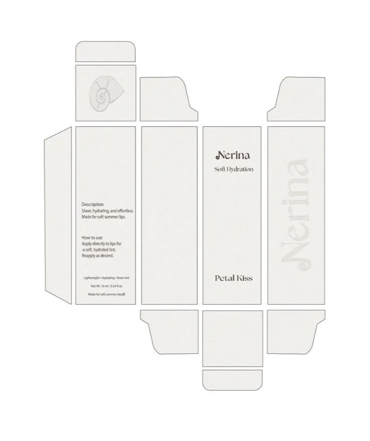
The Packaging
Soft, clean, with a touch of the sea.
The packaging was designed to carry the Nerina identity in a soft and effortless way.
The Nerina logo acts as the main visual anchor, while seashell elements bring the summer concept into the design. I kept the overall packaging clean and refined, allowing the details to add personality without overwhelming the products.
APPLICATION
From concept to reality.
Bringing the visual identity together through physical packaging and product applications.

